QUEENS PUBLIC LIBRARY
SELF-SERVICE REGISTRATION KIOSK FOR LIBRARY E-CARDS
As a non-profit public institution welcoming and serving millions of visitors a year, Queens Public Library was in need of a solution to reduce time spent on registering new customers, offer instant access to materials and services to all members of the community, and save money on paper products by eliminating the excessive use of physical library card applications.
MY ROLE:
UX / UI / DESIGN RESEARCH & STRATEGY/ PROTOTYPING/ USABILITY TESTING
TIME FRAME:
3 MONTHS
RESEARCH
For a foundational understanding behind the process of registering for a physical library card and to discover shared pain points, frustrations, and motivations associated with the process, I facilitated interviews with three user groups. The first group consisted of Library customer service staff in charge of signing new customers up. The second group was made up of new cardholders who recently used the physical library card application to sign up, and the last group included stakeholders, such as members from the outreach department, who regularly work off-site at different library-held events. Each of these groups offered incredibly diverse perspectives and insightful data i was able to create use cases with.
I began my research journey by collecting data about the demographics of residents living within the zip codes of all the Queens Public Library locations, helping me narrow down my user types. Once i began to understand the challenges faced, i started to venture outside to do field research. I tested, observed, and compared different self-service kiosks at retail locations and hotels that helped me create an overall more pleasant experience for my prospective users.
SYNTHESIS
Based on my synthesis from interviewing my subjects and my research findings i created user stories, user journies, and journey maps requiring me to break down the registration form into multiple processes: in-state residents, out-of-state residents, duplicate accounts.
My interviews, demographics, and field research helped me establish personas that i referred to anytime i would find myself stuck in understanding what kind type of user would experience a specific problem.
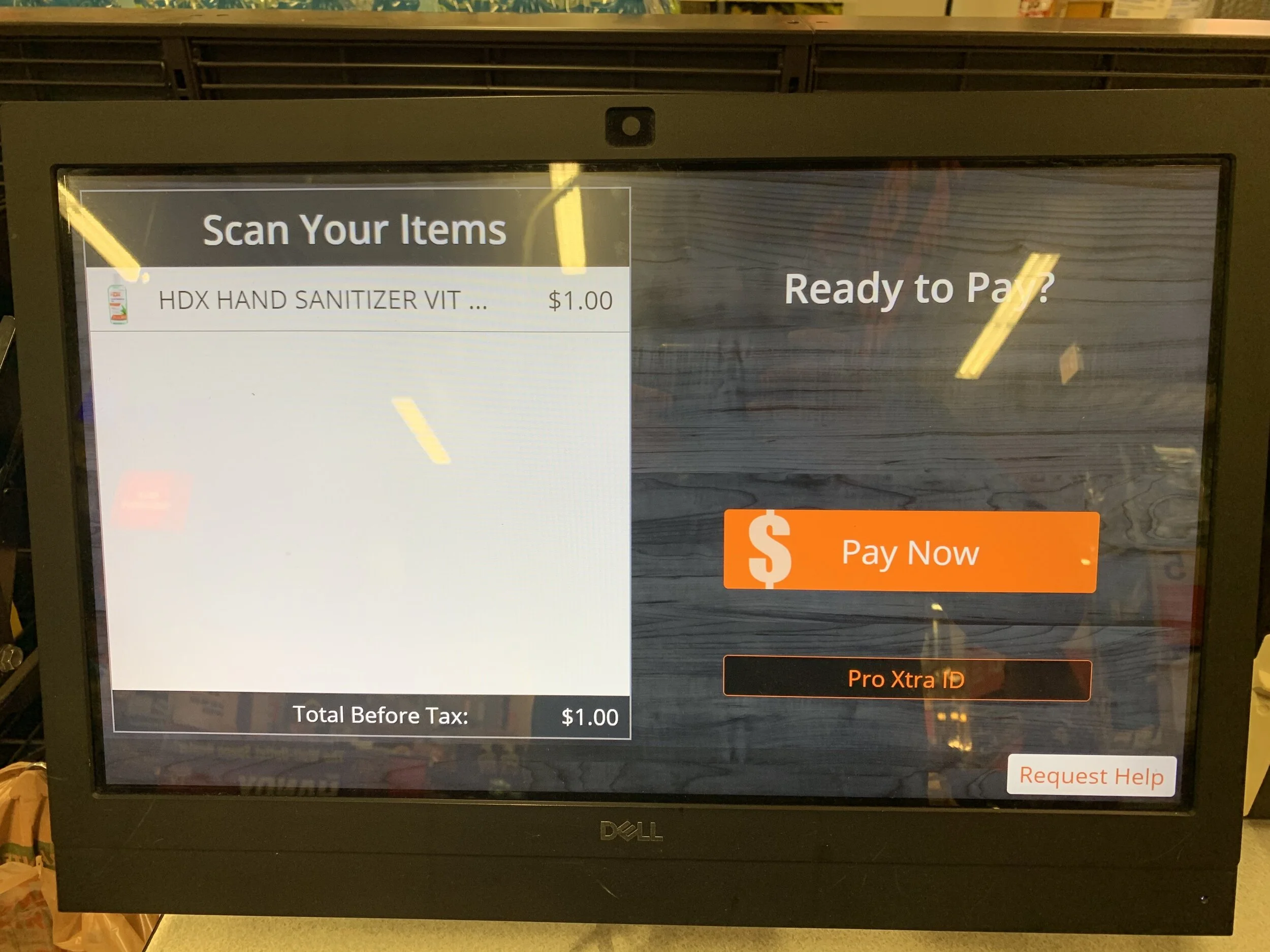
Self check-out kiosk at home depot, from my field research.
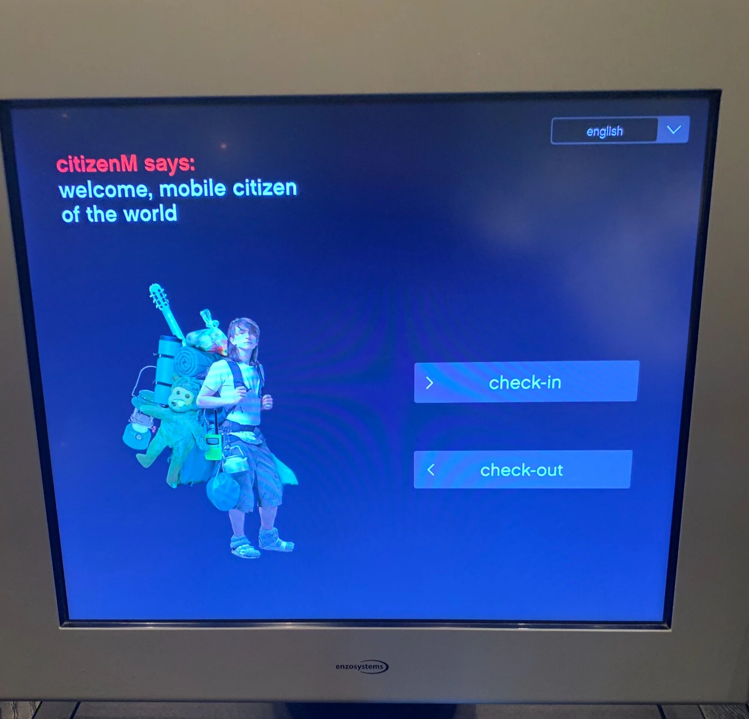
Self check-in service provided to guests at Citizen M hotel in NYC.
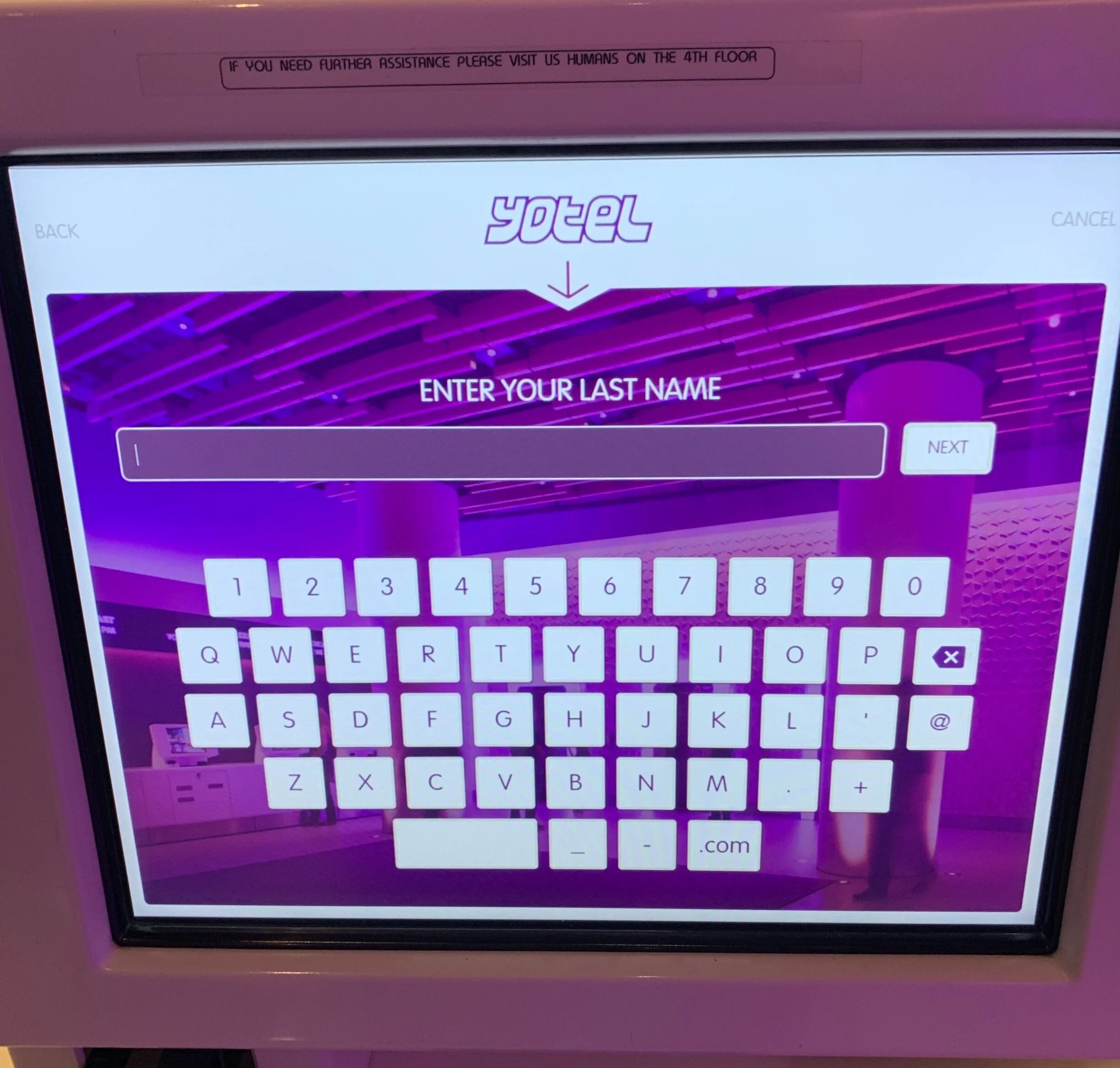
Yotel self-service check-in kiosk.
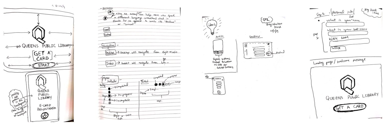
Sketches for landing page / break down of steps for registration form.
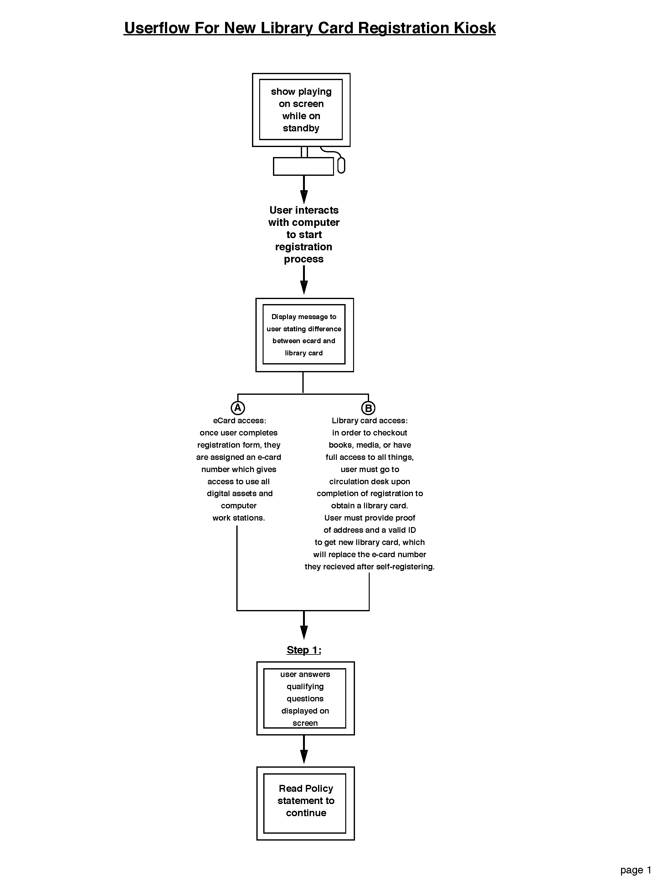
low-fidelity User flow for e-card registration.
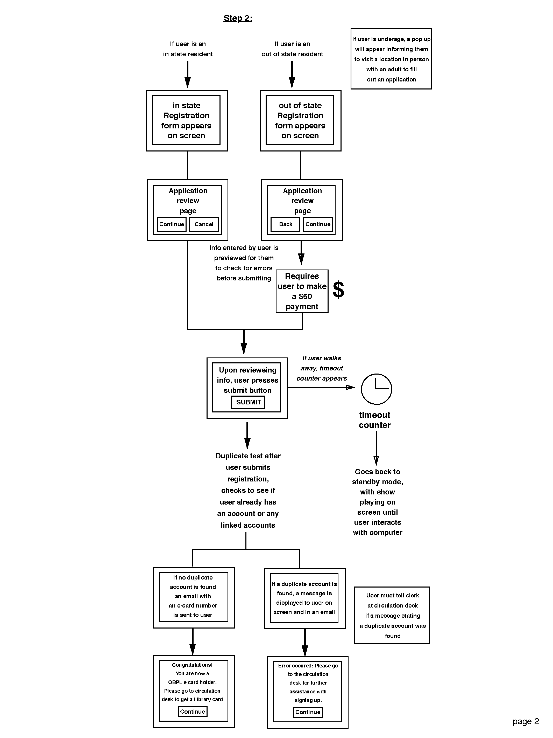
User flow for out-of-state and in-state residents.
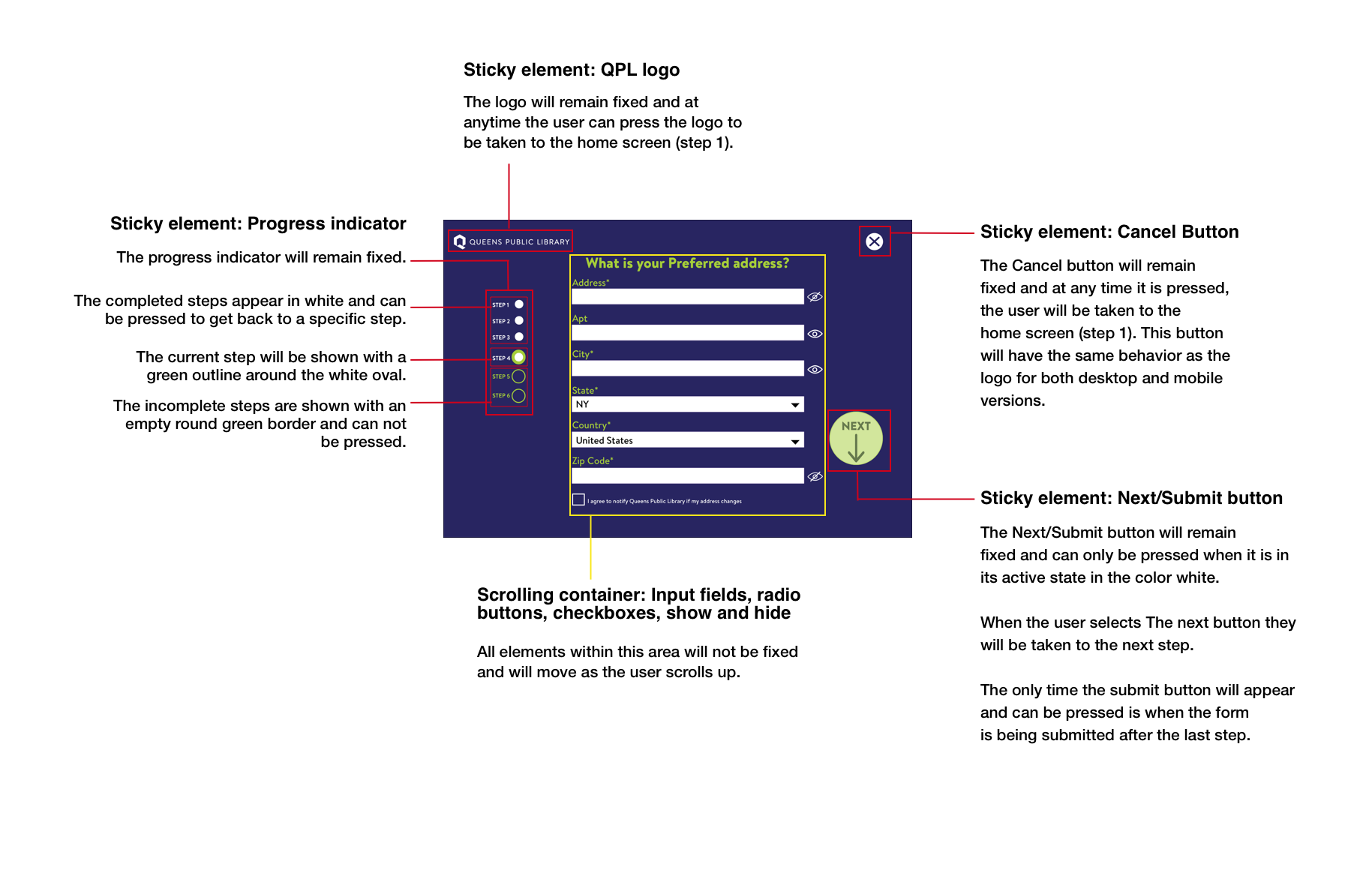
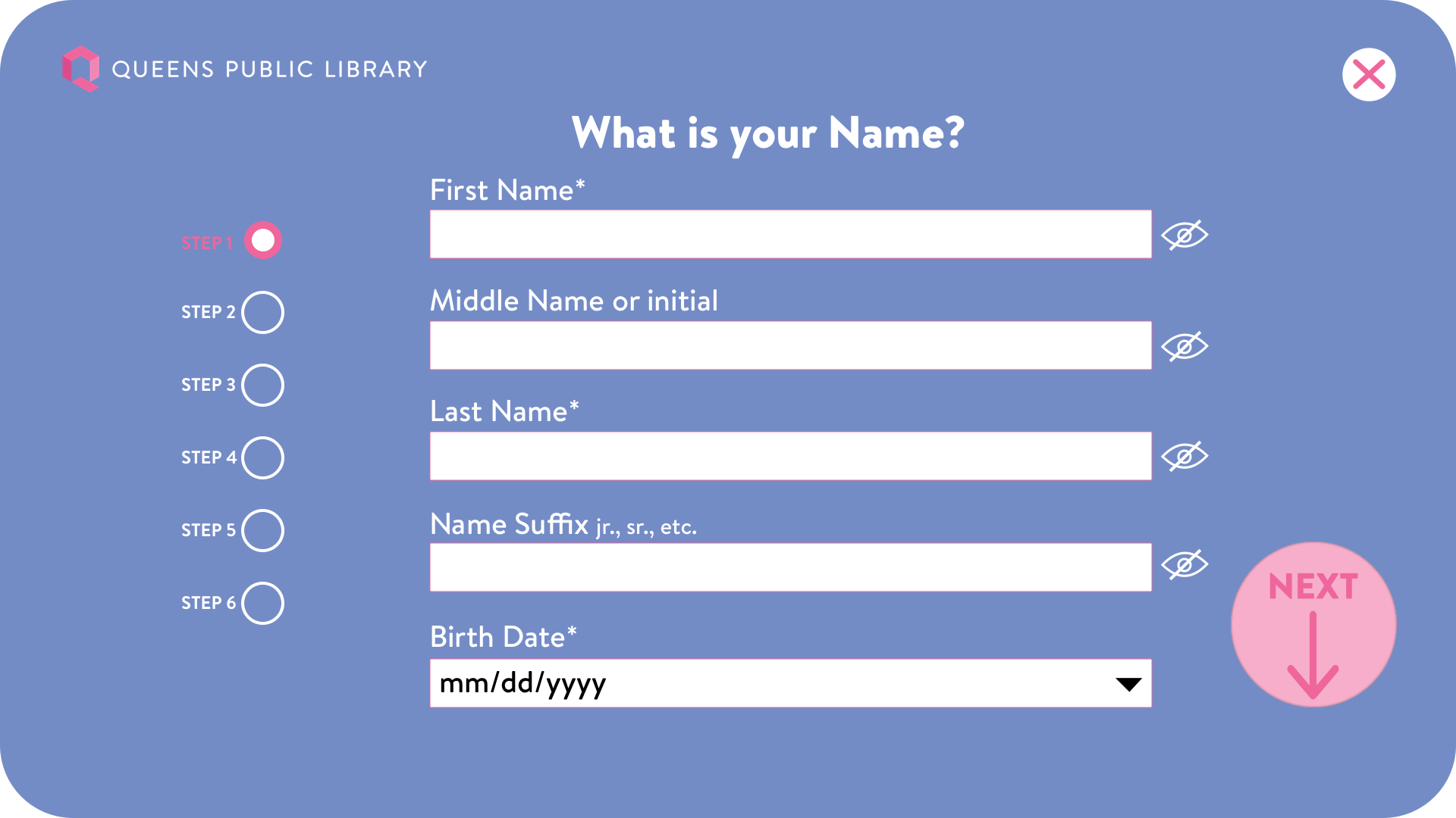
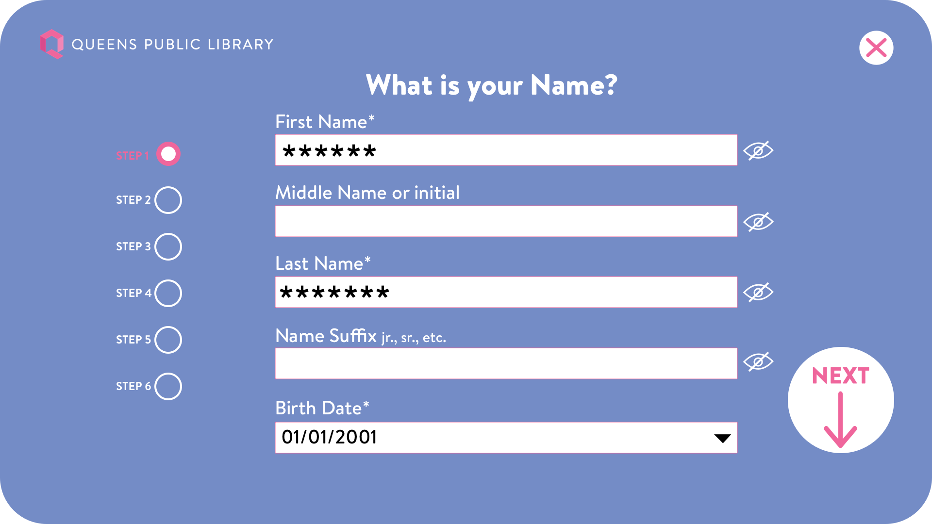
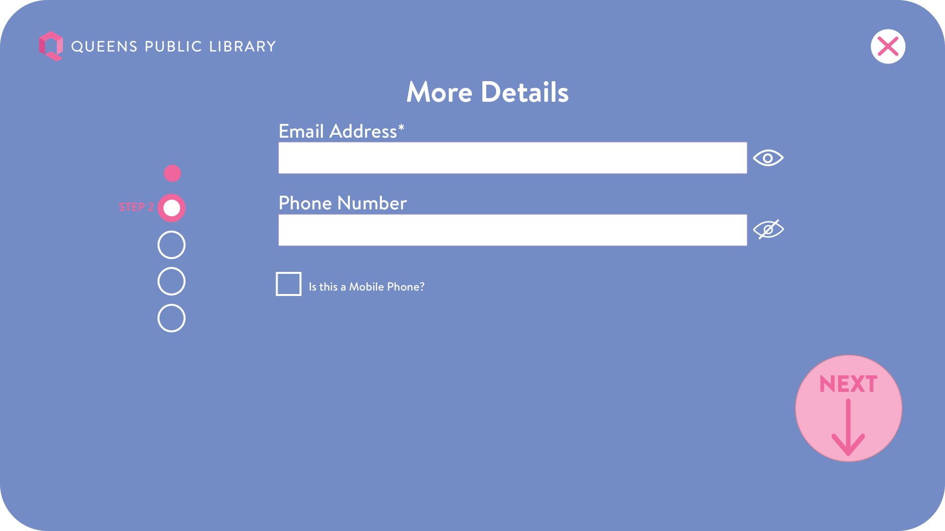
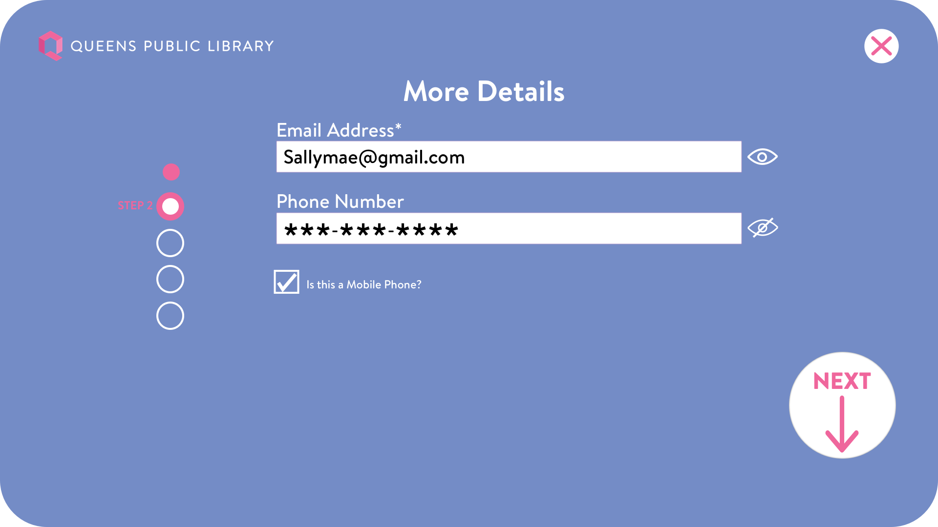
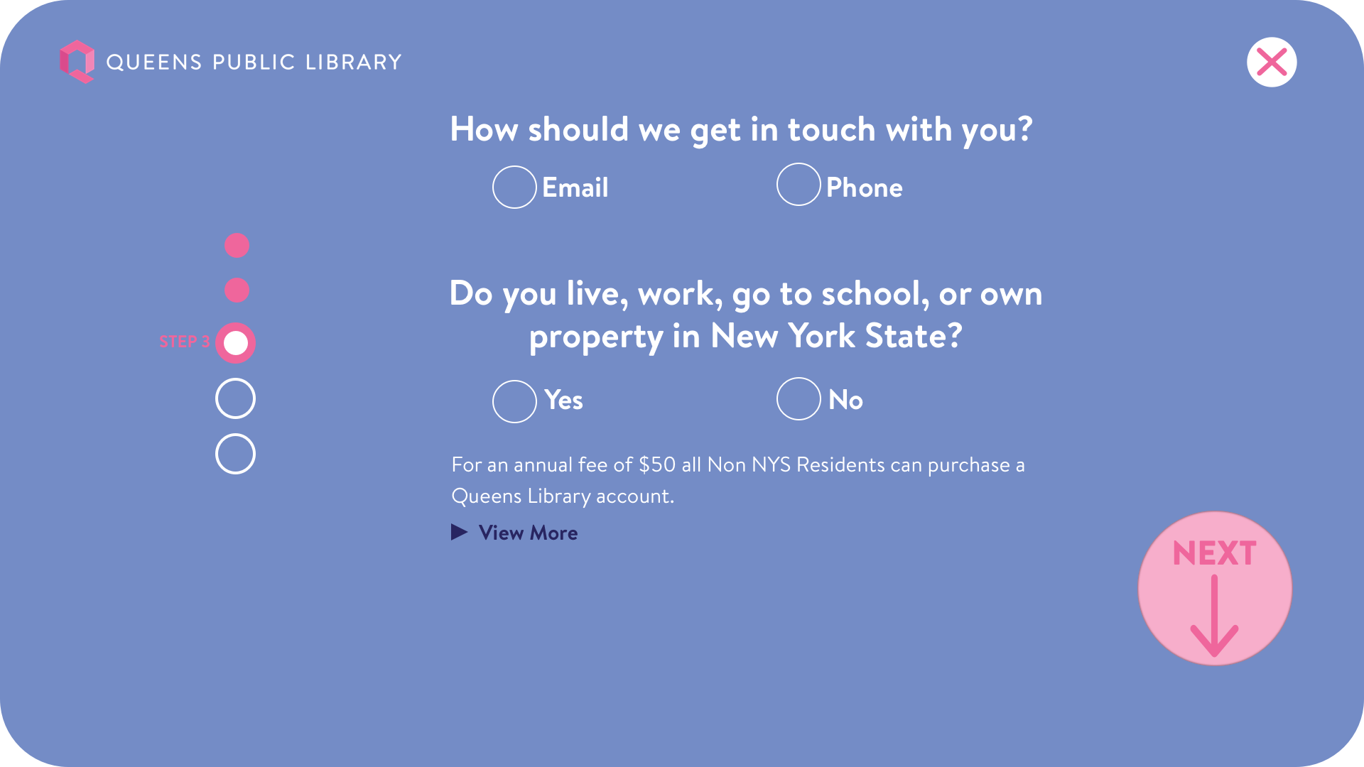
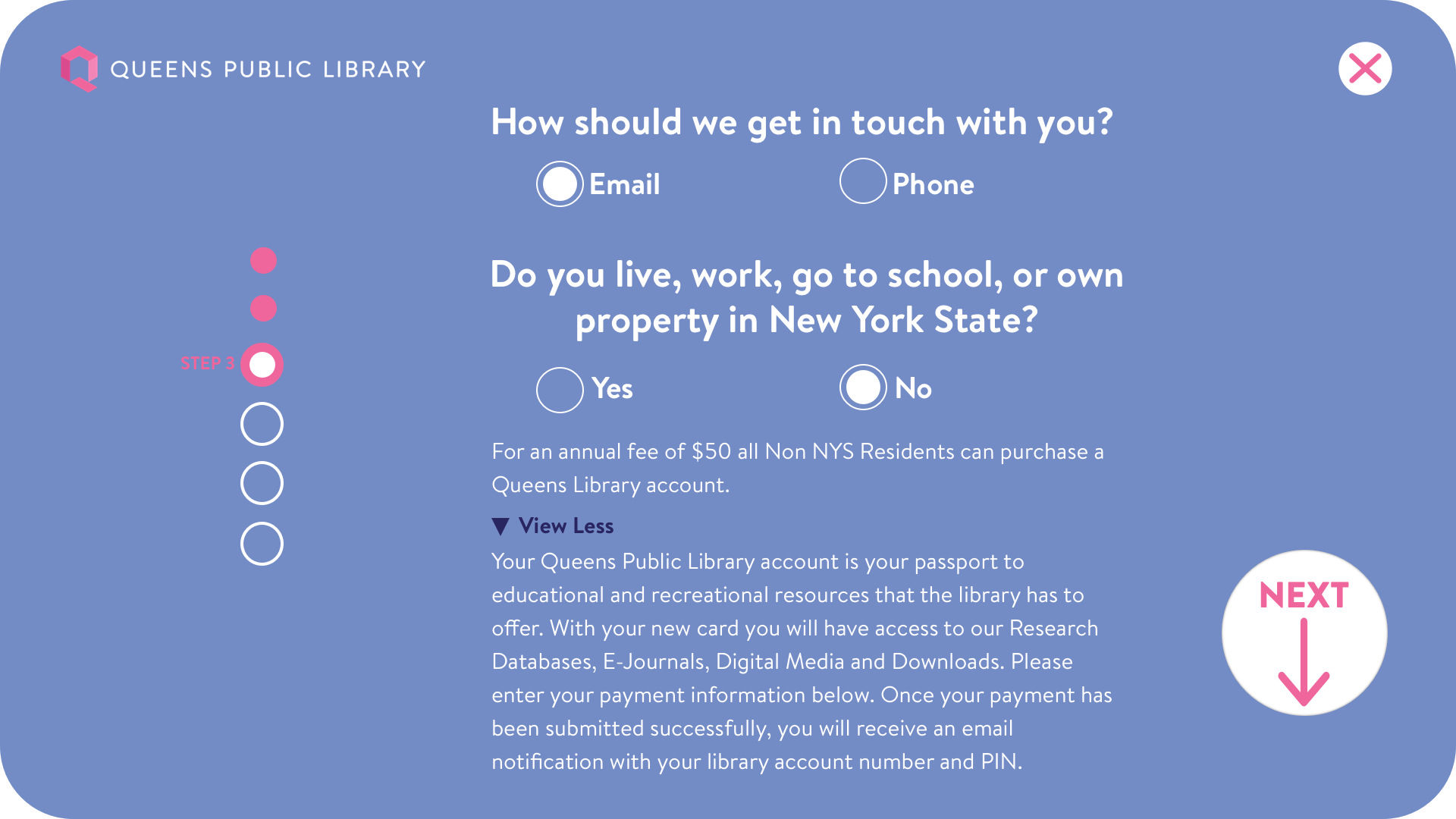
Key interactions and elements of the registration kiosk designs.
DESIGN
I worked on all things relating to the overall User Experience of this product. From UX research & strategy to testing and prototyping, creating personas, user flows, and designing all UI elements. I collaborated with a range of teams from the Marketing department team telling me my color palette for my designs need to be changed because of updated branding guidelines, to going back and forth with developers about why each character input in the form fields needed to be hidden for security and safety purposes, i learned the importance of feedback, reiteration and advocating for what is the best design decision to provide a seamless, familiar experience.
The outcome of my reiterative process was born a simple, user-centered interface, known as, the registration kiosk.
The e-card registration kiosk is a self-service tool that will be used to register patrons at Queens Public Library locations as well as at off-site events and allow instant access to the many offerings by QPL.
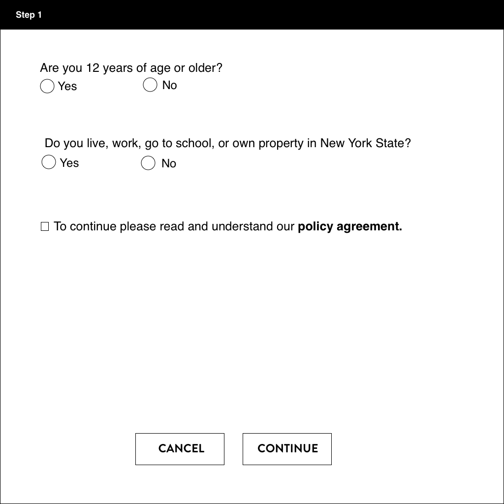
low fidelity wireframe version 1
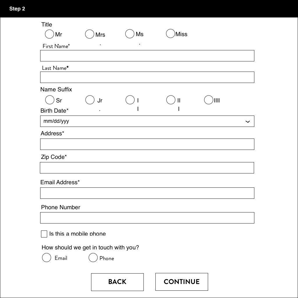
low fidelity wireframe showing data required to complete registration
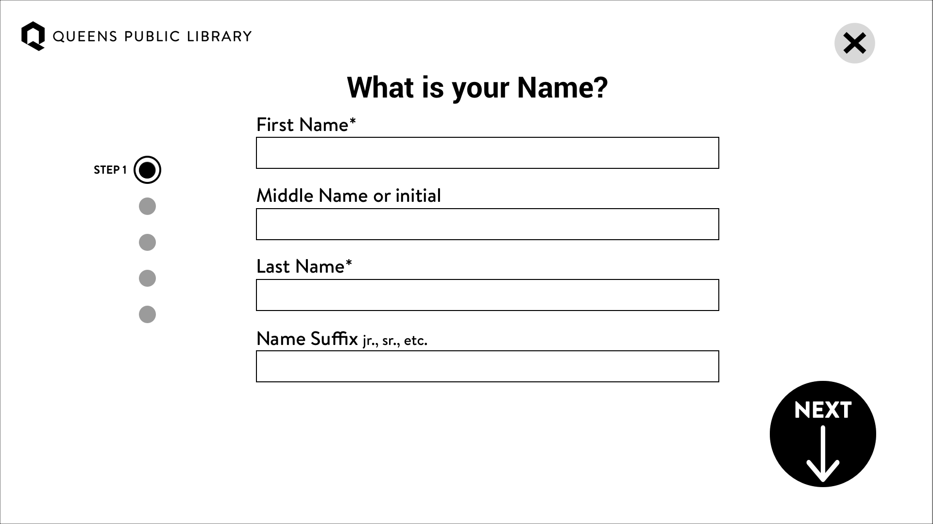
medium fidelity wireframe with all of the Information architecture displayed.
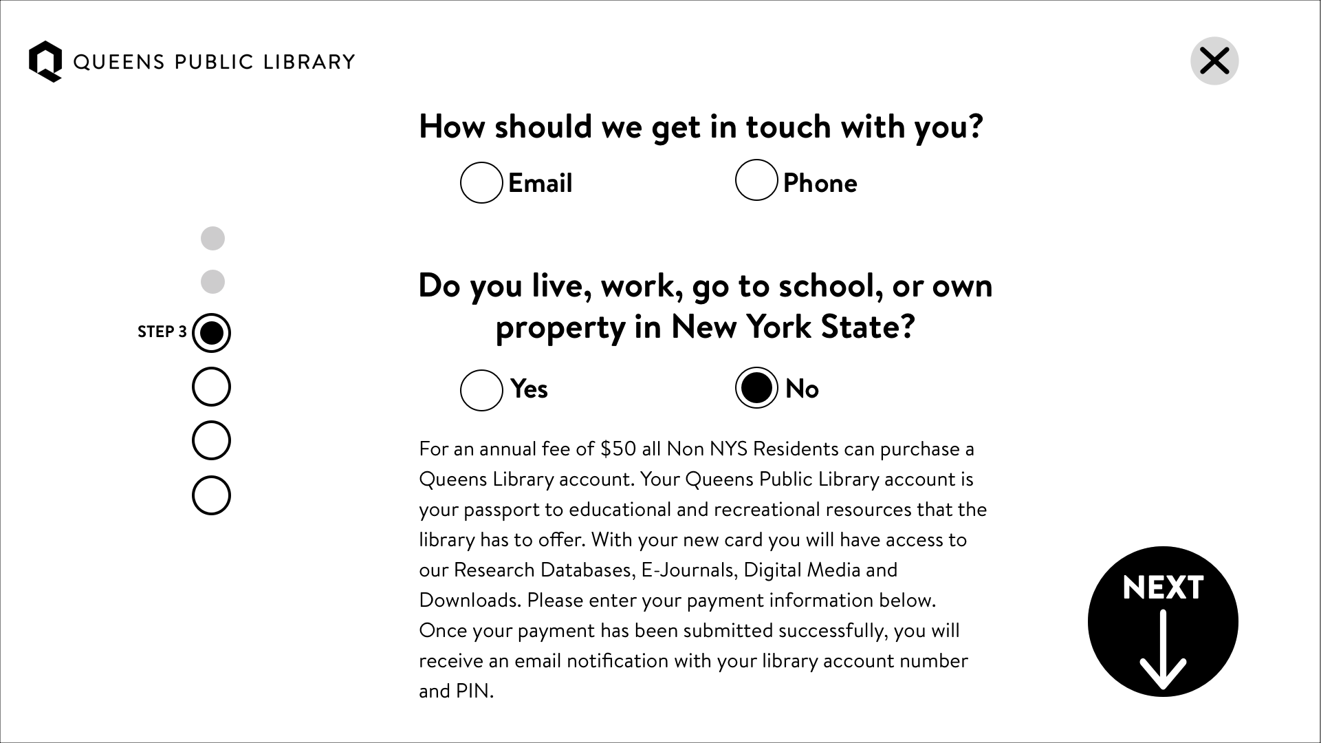
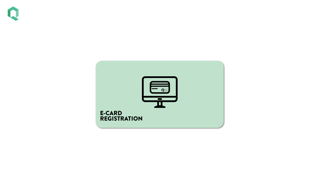
Landing page for registration kiosk. User presses button to begin process.
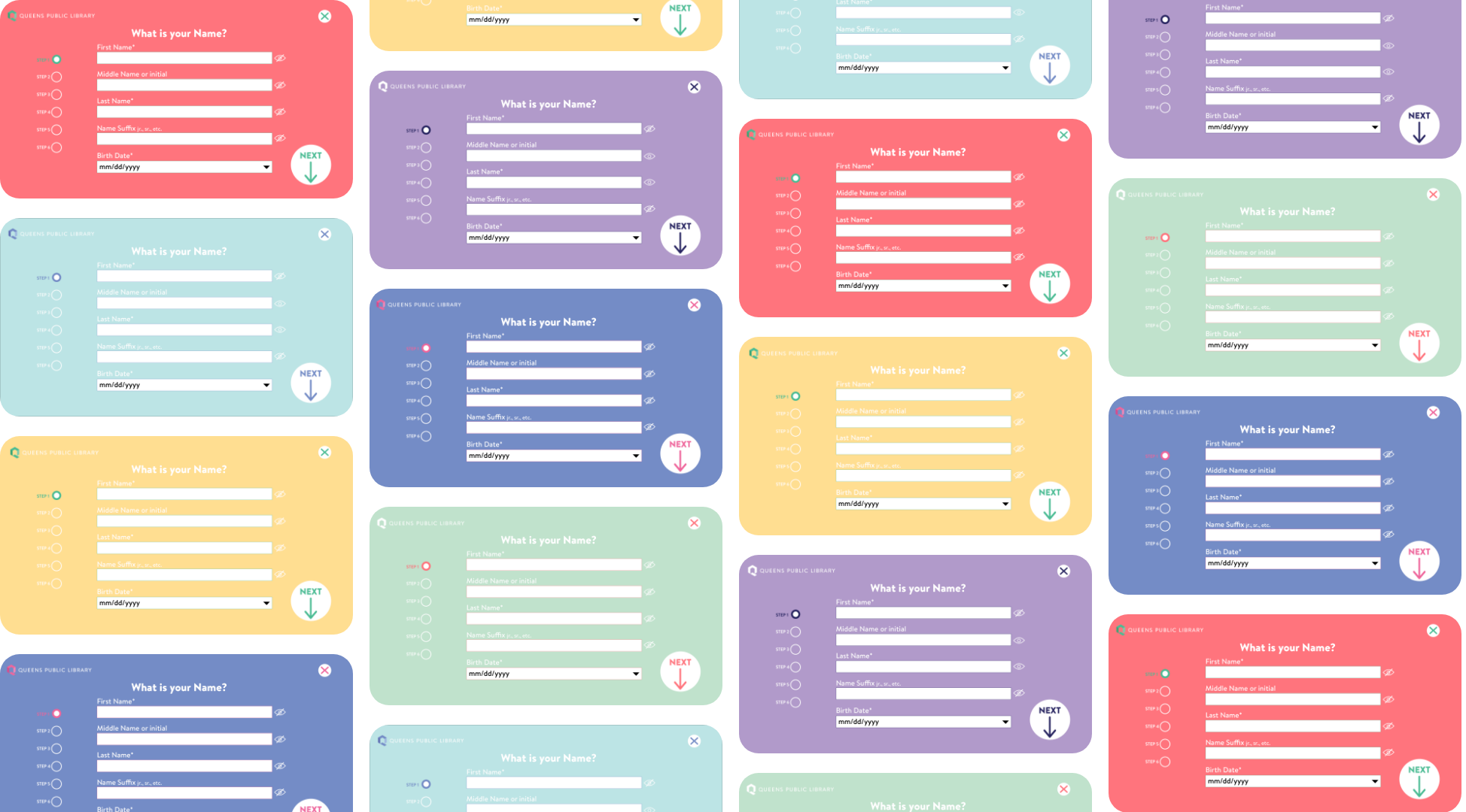
Color variations for the final screens. The color choices were selected from the company branding guidelines.
USER TESTING
The production of the kiosk was halted at the start of the pandemic and it is temporarily being turned into a website until the library reopens for in-person service.
This caused a delay in user testing of the registration form on the kiosk, which will ultimately help determine what changes need to be made and what parts of the form works for users.